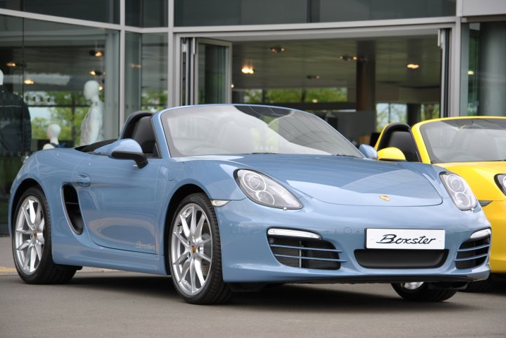
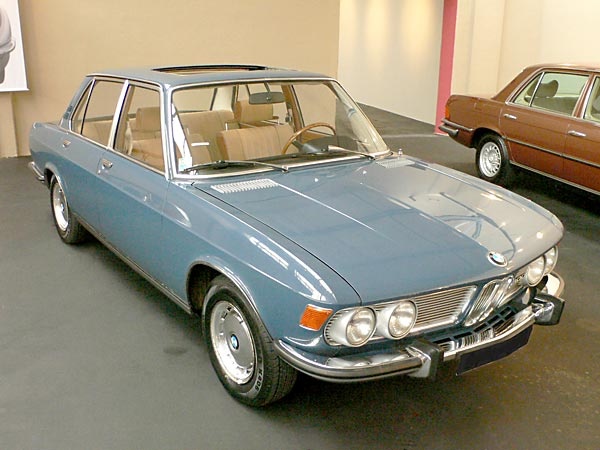
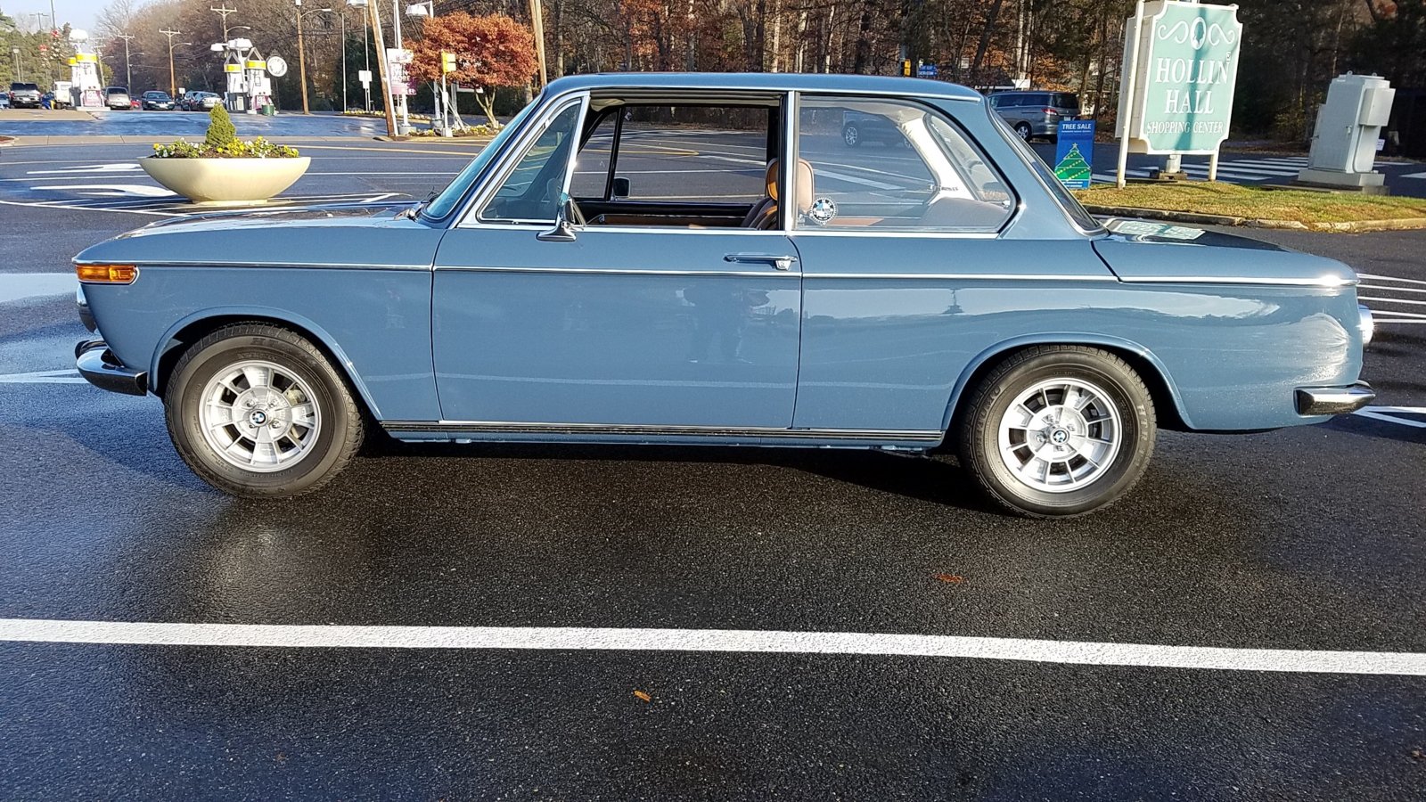
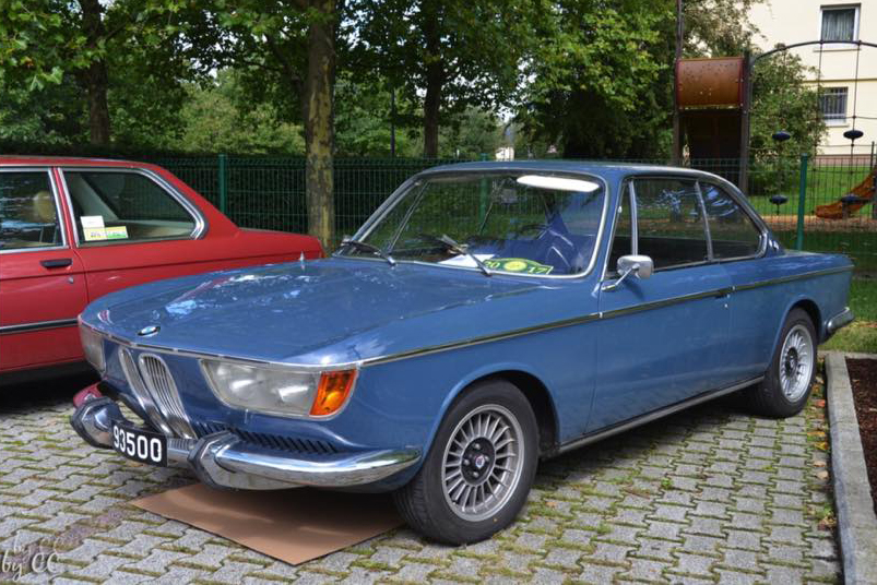
After painting a test piece in Bristol and finding it looked like the primer I'm using on the Bav, I searched for some nice blues...Sooo....I came across Porsche's Etna Blue, which is, apparently, a color throw back from the 356..and man, I really like it! I think this would look great on the Bavaria. I don't like dark colors on these and the BMW blues I looked at just didn't quite tickle my fancy...Any opinions? I feel like the lines of the E3 would really work with it..

You are using an out of date browser. It may not display this or other websites correctly.
You should upgrade or use an alternative browser.
You should upgrade or use an alternative browser.
COLOR THOUGHT..
- Thread starter StephenZ
- Start date
I'll shoot a test piece in the next few weeks and see what it looks like next to the car..
*wonder if I could get a custom bmw color tag with Etna Blau on it..lol
*wonder if I could get a custom bmw color tag with Etna Blau on it..lol
Pastelblau from 75/76 and 320i is very similar, you should check it out, and it would be correct for a Bav.
http://e9-driven.com/BMW-Current-Colors.pdf
I like Bristol but it can look like a non-metallic Polaris.
http://e9-driven.com/BMW-Current-Colors.pdf
I like Bristol but it can look like a non-metallic Polaris.
Pastelblau from 75/76 and 320i is very similar, you should check it out, and it would be correct for a Bav.
http://e9-driven.com/BMW-Current-Colors.pdf
I like Bristol but it can look like a non-metallic Polaris.
Pastelblau came to my mind immediately as well. How about Mintgrun? Also a ‘75 e3/e9 color...
I think that etna blue is kinda flat. it's going to take like 8 layers of clear to give it the depth
I think that etna blue is kinda flat. it's going to take like 8 layers of clear to give it the depth
I saw that description on a website...can you explain the way they use the term 'flat' here? It's obviously glossy paint in the pic, not an actual flat, dull finish...so, do they mean not metallic and sparkly, or something? Serious question...I realized I could sound a little sarcastic in print..;-).
Also, I like Pastelblau a lot, but, it seem like it might be too light of a blue for the vast real estate of the Bavaria?...it looks great on the clown car ish 02 (I say that with love, I've owned 2 and wish I still had my second one!) Mintgrun I do not like at all...just awful, in my opinion, of course. Fantastic on kitchen appliances, though!
Markos, is that Pastelblau in your post? It looks darker than I normally see, I do like that a lot...hmmm...
Markos, is that Pastelblau in your post? It looks darker than I normally see, I do like that a lot...hmmm...
It is Pastelblau. I agree that it looks darker in the pic. Who knows if they got it right and what happened with the photography.
I think Riviera could be the best blue for the Bav...slightly darker than Pastellblau, making it a nicer fit for a four door, IMHO..
This was on Pinterest as Riviera, but looks more like Pastellblau to me...Thoughts?

A little too light to be Riviera. Looks amazing though, it’s an early 2800.
i like riviera as well as baikal on an e3. fjord also looks good as well
A little too light to be Riviera. Looks amazing though, it’s an early 2800.
Very sharp looking car..love how clean and fresh it is.
i like riviera as well as baikal on an e3. fjord also looks good as well
I really like baikal, and it's what I originally wanted to do, but I was trying to stay away from shooting a metallic..I'll have to do the hood and trunk separately, and it's so hard (for me at least) to keep metallics looking exactly the same if you shoot on different days..it's like voodoo, and I'm not a witch doctor...;-). I managed to get my cj5 to look pretty good, but man, it was a challenge..
Riviera 2002, very nice!

WOW. Okay, that is gorgeous!! Now that is what I'm talkin' about! Gave me shivers...well, it's a little chilly in my house, but still....lol
Riviera is lovely, and very rare.
How about Caribe, an NK and early “e10” color

How about Caribe, an NK and early “e10” color
Riviera is lovely, and very rare.
How about Caribe, an NK and early “e10” color
View attachment 58087
Ha! I have another browser opened right now with Caribe. definitely very sharp, indeed, but I think the slight gray tone of the Riviera, when compared to Caribe, gets my juices flowing a bit more...and my juices don't flow these days without much motivation..still talking cars here...get your mind out of the gutter...lol.
I get why you're asking. I just meant that the paint has little depth. I know that most vintage color palettes leave a lot to be desired and I have been struggling with picking a color for mine because I don't want to use modern colors and metallics. The E3 has long flat panels and tight curves, so most paints are going to look like they lack the depth of reflecting light from within the paint, rather than just at the topmost surface.can you explain the way they use the term 'flat' here?
one way to describe it is when you look at a sunset, you know the light source is coming from below the horizon, so what you're seeing is light bouncing off the atmosphere and giving you a particular show of radiant light waves. To get that on older cars like ours, you have to polish the hell out of them so the light bounces between the paint and clear/polish.
I still don't know if I made my point, but I'm done rambling while I finish my coffee
MatthewCervi
Member
Colors are so subjective. Personally, I feel like vintage color palettes are so much richer than what is commonly available today, and the good colors today are almost always metallics which I don't always like.I know that most vintage color palettes leave a lot to be desired...
...To get that on older cars like ours, you have to polish the hell out of them so the light bounces between the paint and clear/polish.
BTW, older cars used single-stage paints that did not have a clear coat. Maybe that's the difference you're seeing? You can certainly get vintage colors in modern two-stage form, and in fact most places outside of restoration shops would prefer to shoot that anyway.

