.
You are using an out of date browser. It may not display this or other websites correctly.
You should upgrade or use an alternative browser.
You should upgrade or use an alternative browser.
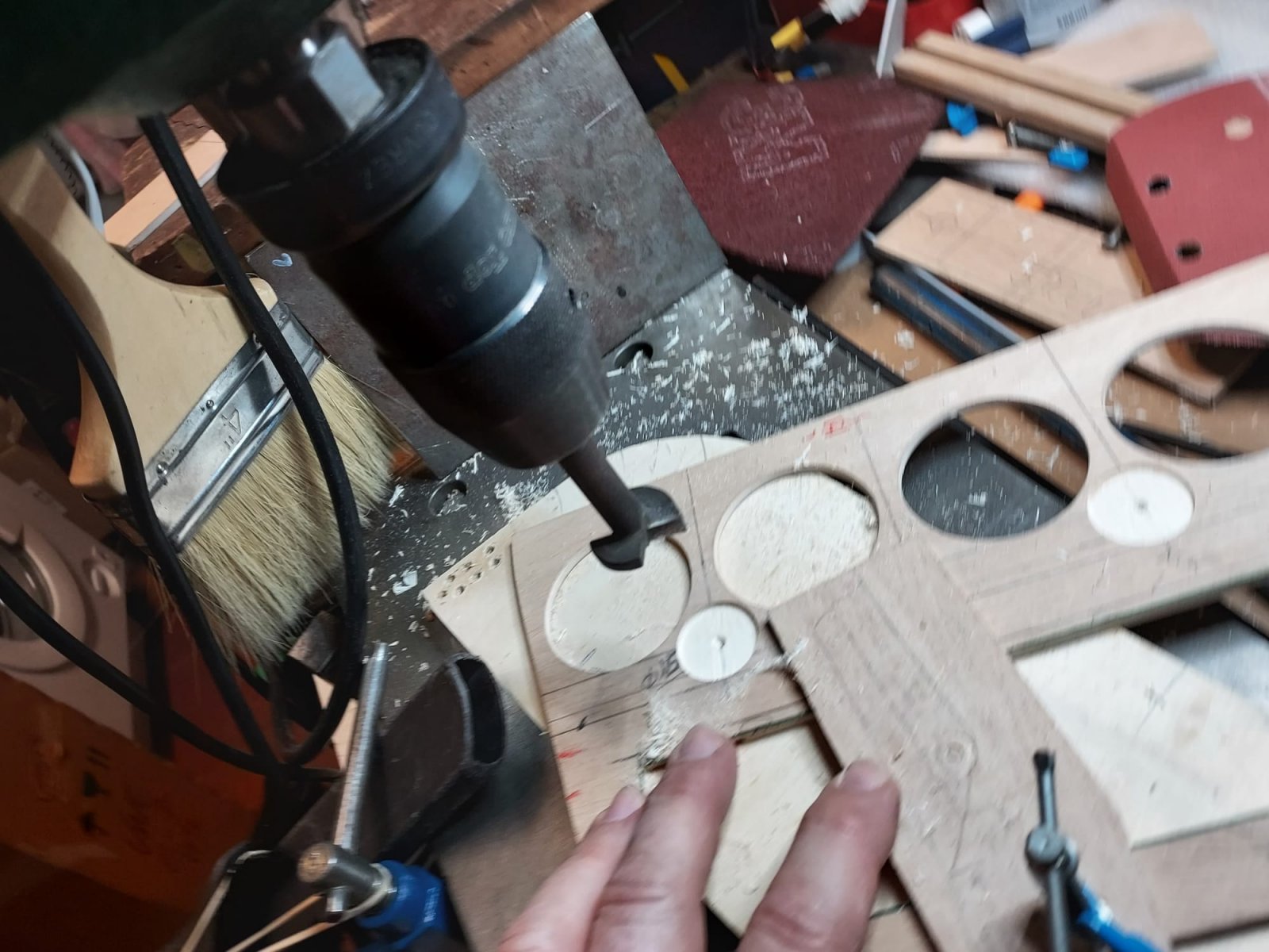
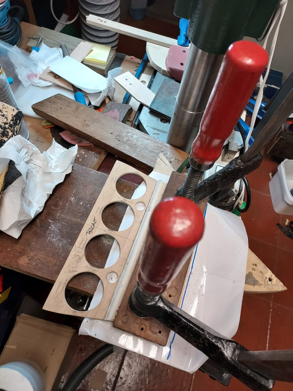
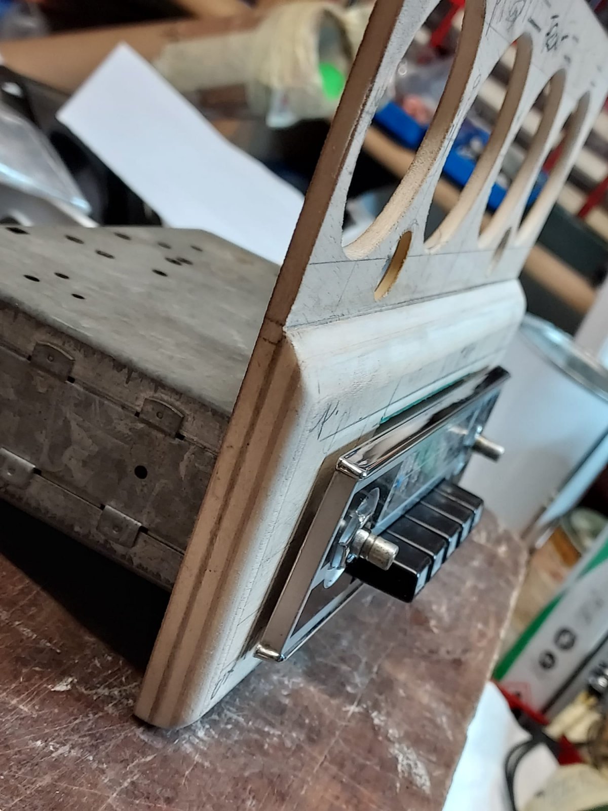
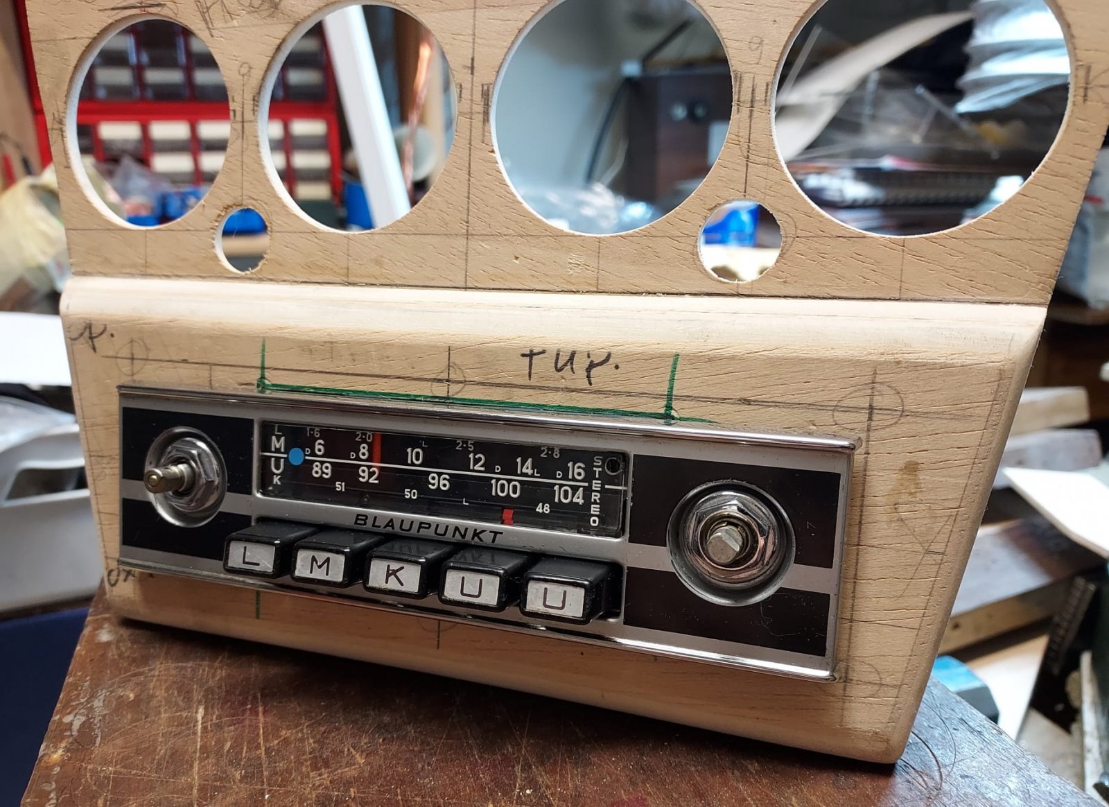
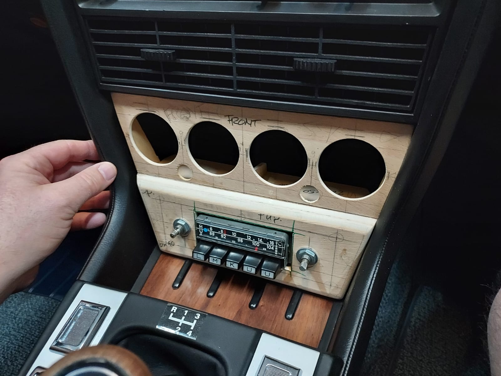
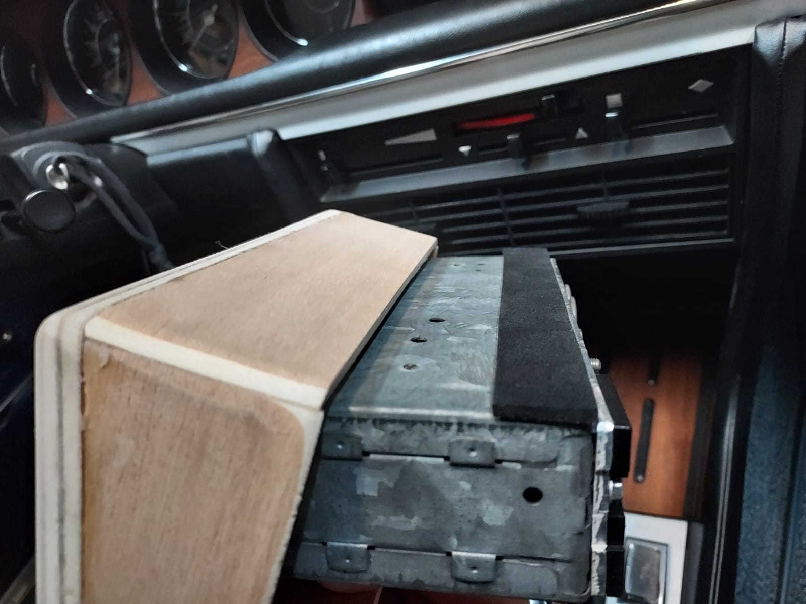
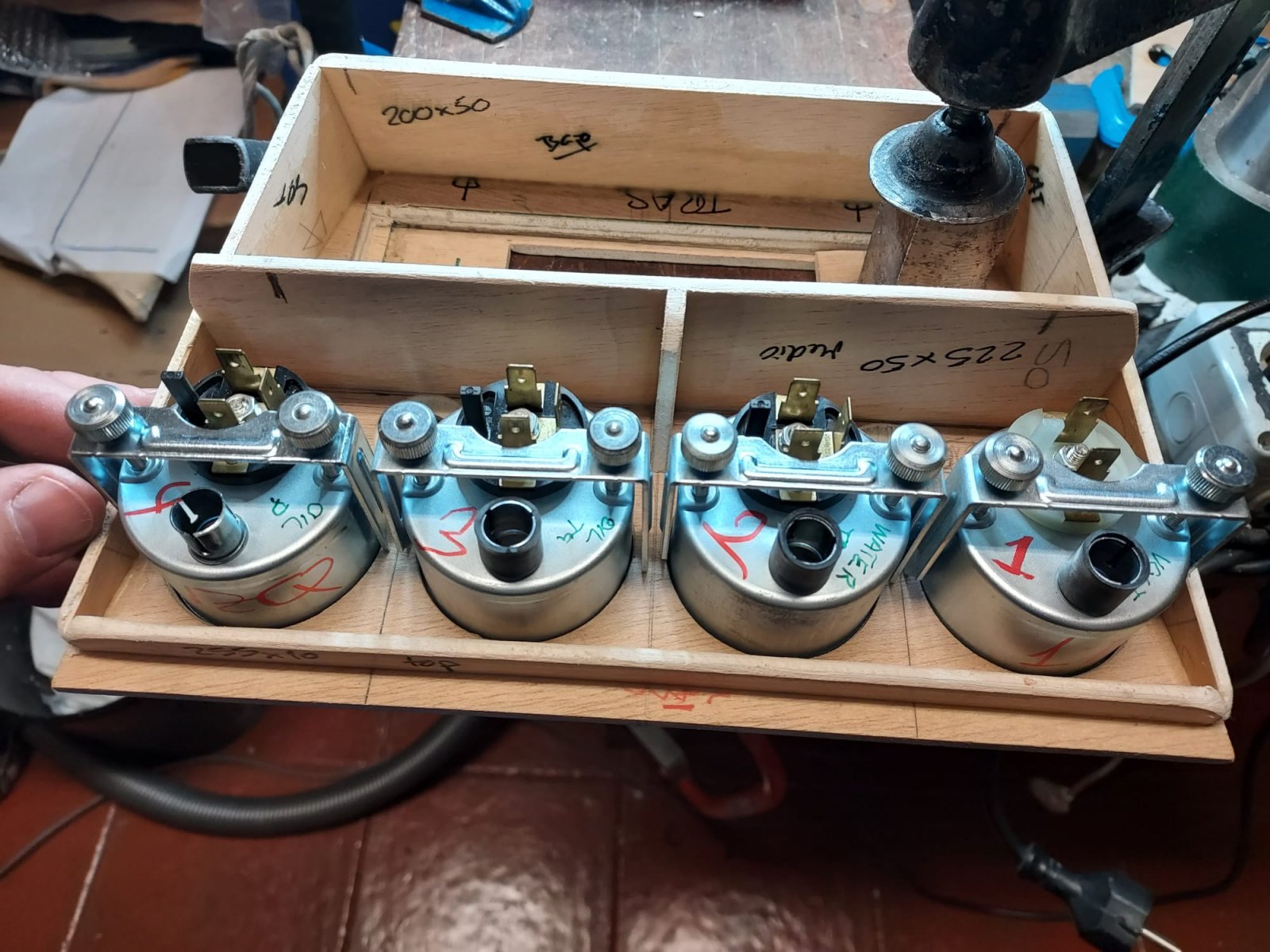
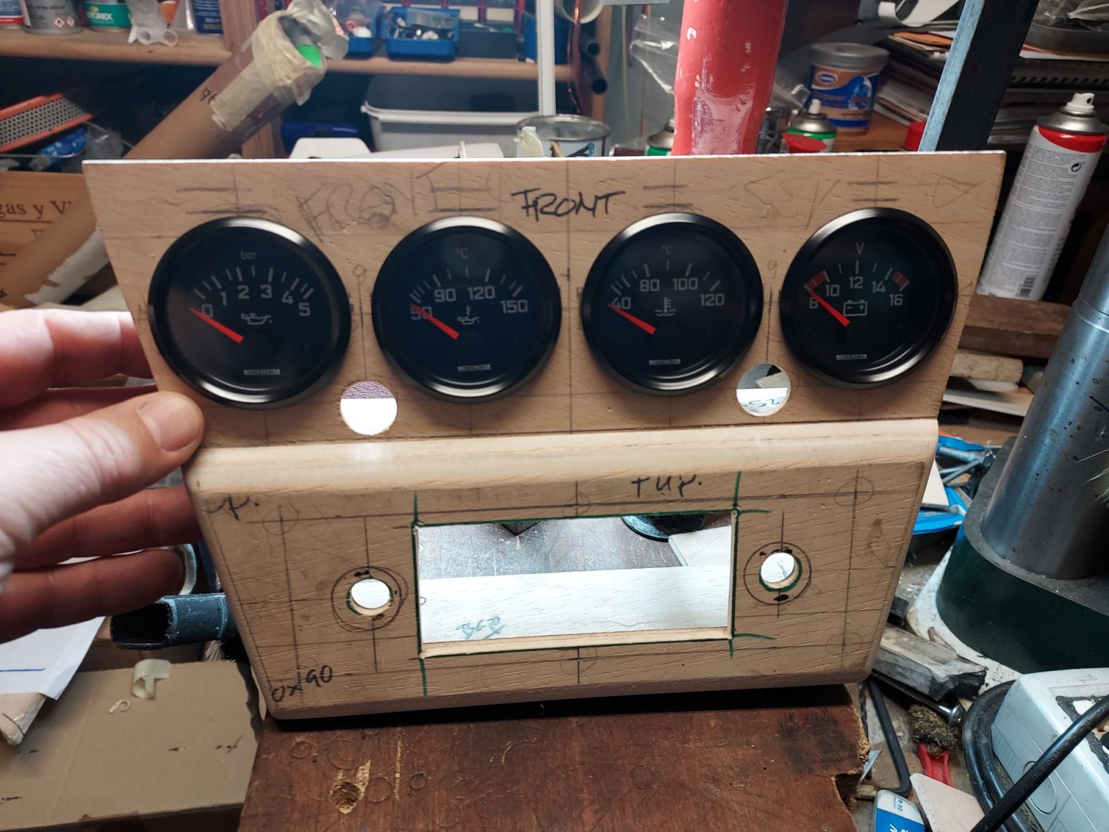
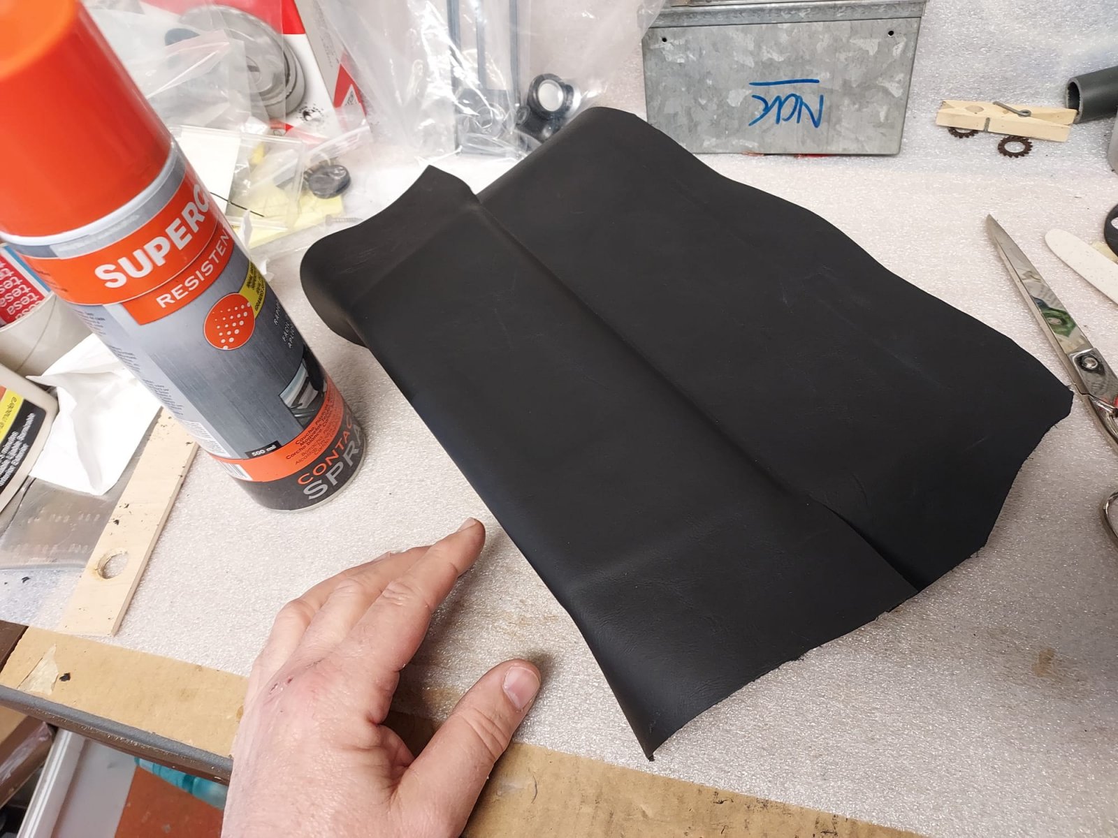
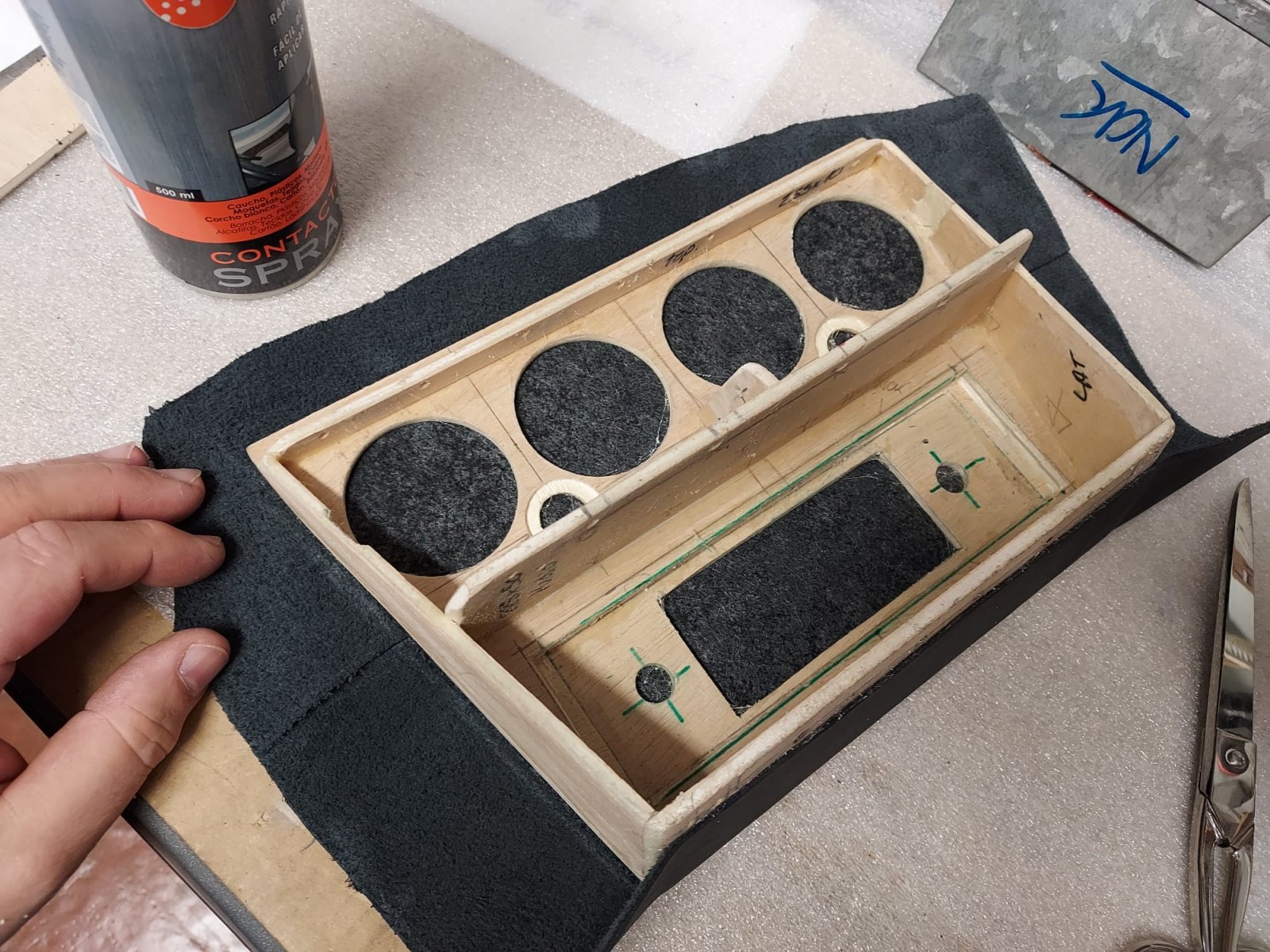
new integrated console for gauges and radio
- Thread starter deQuincey
- Start date
And,….
tdgray
Well-Known Member
Really nice… MG switches? Like those style.
This time radio is bigger, and has all the functions…
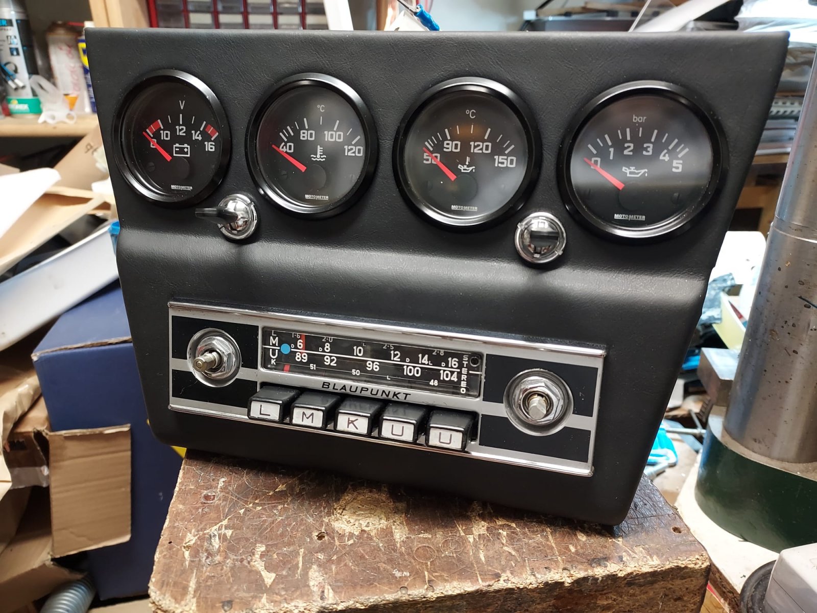
It gets easier, every new one…I already know the job
It gets easier, every new one…I already know the job
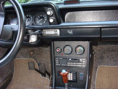
Looks great. I did something similar to my 2002 back in 1983 (or thereabouts). See pic.
I got rid of the ashtray and fabricated a sheet steel face that would fill the front of the console top to bottom. I placed cutouts for the hazard switch (in its original location) and new oil pressure and volts gauges and stereo and other bits. I used VDO Cockpit series gauges. I found some nice looking vinyl that seemed to match the dash pretty good and bonded that to the sheet metal.
The sides of the face had 1" wide flanges bent back at 90 degrees and I placed nutclips on the flanges that picked up fastener locations used with the original radio and ashtray fittings.
The Sony stereo was a pull out unit that I could then plug into my pickup truck... Oh the days of being single... LOL
The LED (above the stereo) was for showing the alarm being armed).
There are three items below the stereo.
Left to right -
Stereo Power (so I could run the stereo without the key being on in addition to the key)
Alpine Alarm
Switch for my driving lights (DPDT switch). I could run the lights on their own or have them come on with the high beams.
I had fun putting this all together. Man - time flies.... 40+ years ago I did that. I used to be handy - LOL
Attachments
Last edited:
Looks great. I did something similar to my 2002 back in 1983 (or thereabouts). See pic.
I got rid of the ashtray and fabricated a sheet steel face that would fill the front of the console top to bottom. I placed cutouts for the hazard switch (in its original location) and new oil pressure and volts gauges and stereo and other bits. I used VDO Cockpit series gauges. I found some nice looking vinyl that seemed to match the dash pretty good and bonded that to the sheet metal.
The sides of the face had 1" wide flanges bent back at 90 degrees and I placed nutclips on the flanges that picked up fastener locations used with the original radio and ashtray fittings.
The Sony stereo was a pull out unit that I could then plug into my pickup truck... Oh the days of being single... LOL
The LED (above the stereo) was for showing the alarm being armed).
There are three items below the stereo.
Left to right -
Stereo Power (so I could run the stereo without the key being on in addition to the key)
Alpine Alarm
Switch for my driving lights (DPDT switch). I could run the lights on their own or have them come on with the high beams.
I had fun putting this all together. Man - time flies.... 40+ years ago I did that. I used to be handy - LOL
so, Kevin, that was very nice and handy, yes
well done !
Adding these photos to share result and question what is the opinion, without or with instruments+radio ? Which one looks better ?
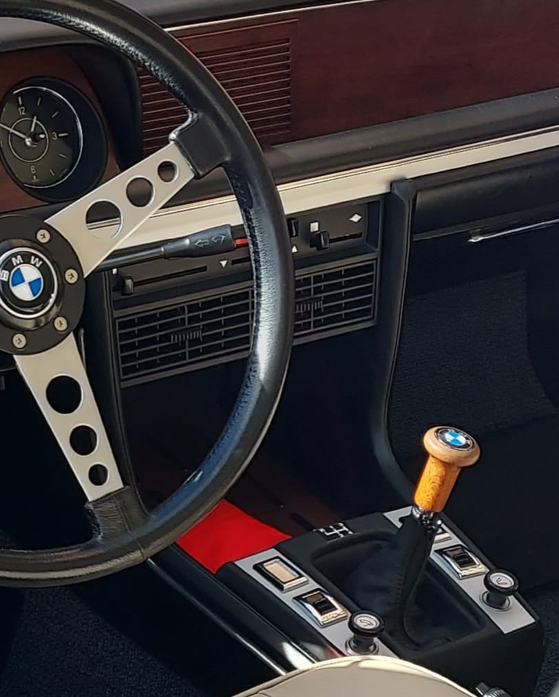
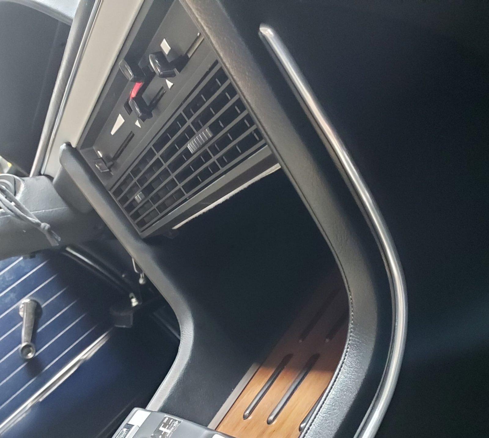
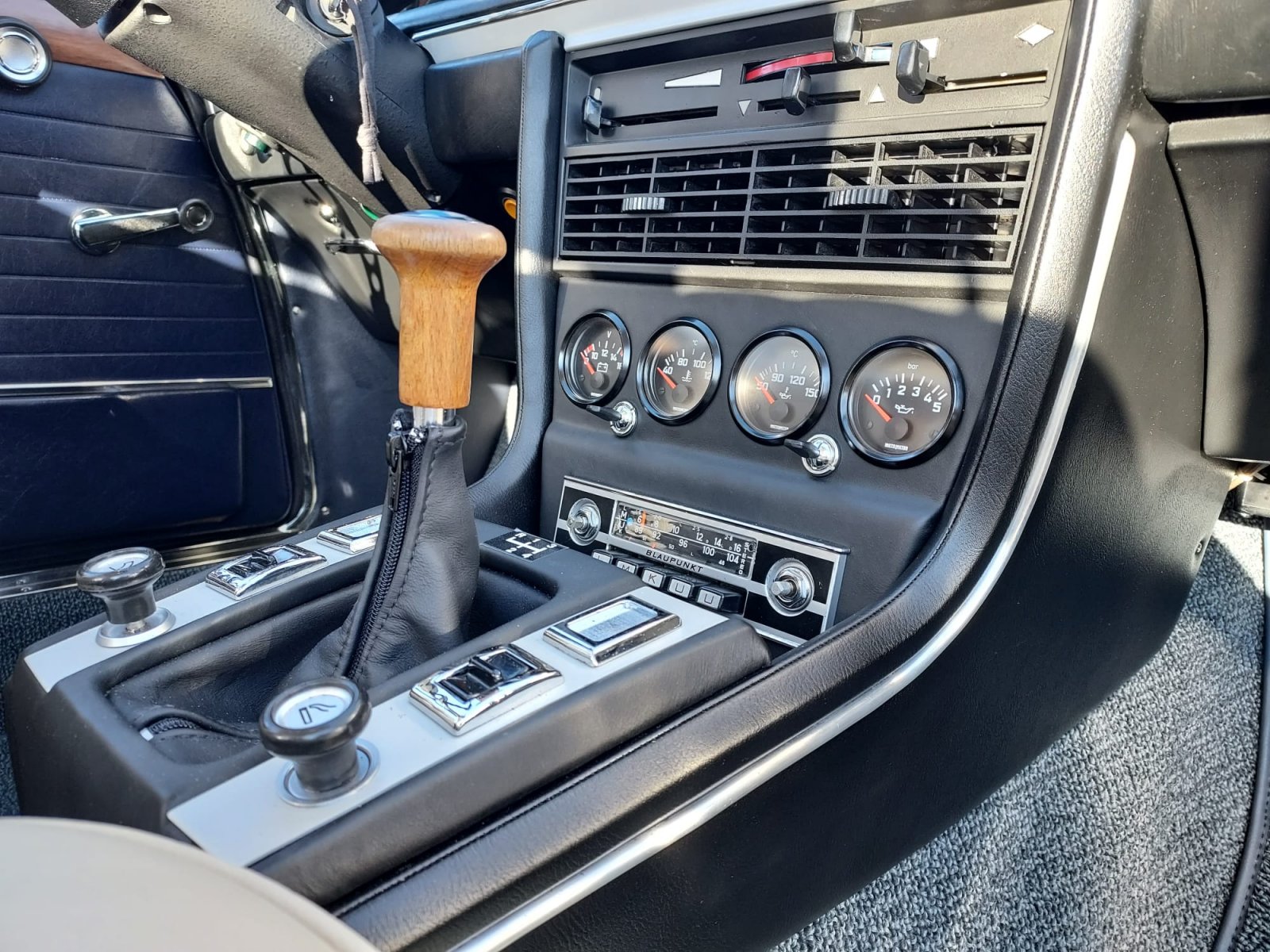
well, that is a tough choice!
It's kind of a trade off. I do like the wood tray, as i find it classy and handy for sunglasses at the same time.
But, then having the info from the additional guages to me adds a lot when one is inclined to do spiritted driving. As an engineer I appreciate data!
why did you redesign it by the way? it looks so similar to your 2015 version.
thank you Erikwell, that is a tough choice!
It's kind of a trade off. I do like the wood tray, as i find it classy and handy for sunglasses at the same time.
But, then having the info from the additional guages to me adds a lot when one is inclined to do spiritted driving. As an engineer I appreciate data!
why did you redesign it by the way? it looks so similar to your 2015 version.
i never said it was an easy choice, that is why i appreciate it more...
yes, right, there is a reason...to redesign
as the car has been redone holistically,
the interior too, then when installing the new dash+new consoles+new heater+.......the resulting width was less than the 2015 config.
plus swapped the ludwischafen mono for a frankfurt stereo
BTW, there is still room in the wood tray for mobile phone, and sunglasses, a better view will adress it
You did an excellent job with the integrated console—great craftsmanship. Given the utility that the gauges present, your integrated console, in my opinion, provides the best presentation for someone who wants to keep a radio and gauges. I am currently in the process of looking at how best to install gauges on a non-AC car with a Blaupunkt radio and your design looks very appealing.
I went without a radio:You did an excellent job with the integrated console—great craftsmanship. Given the utility that the gauges present, your integrated console, in my opinion, provides the best presentation for someone who wants to keep a radio and gauges. I am currently in the process of looking at how best to install gauges on a non-AC car with a Blaupunkt radio and your design looks very appealing.
i like the little gauge 'hoodies' you put on. inquiring minds want to know - where did you get those?
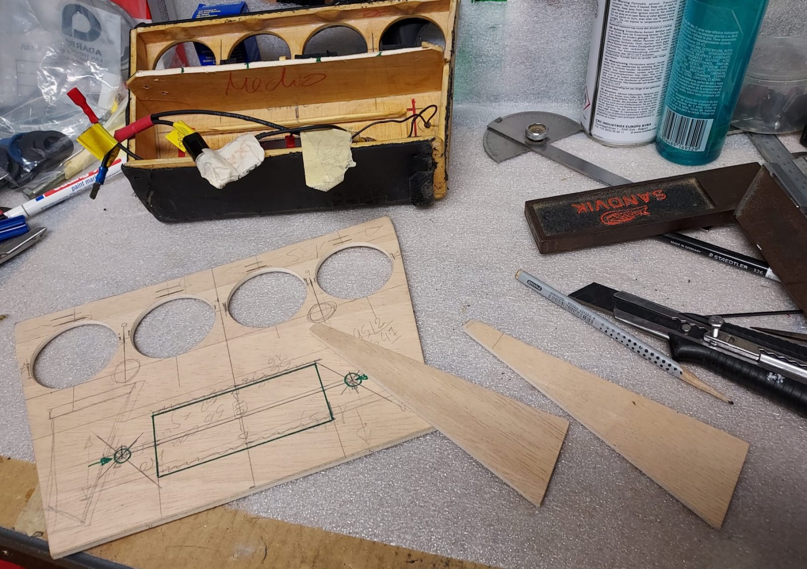
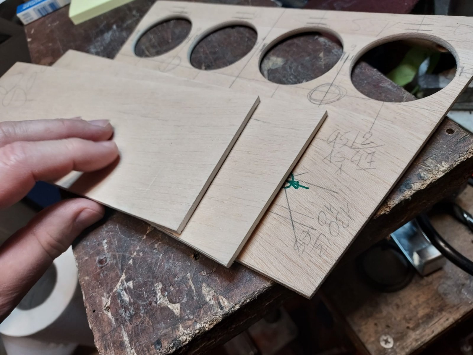
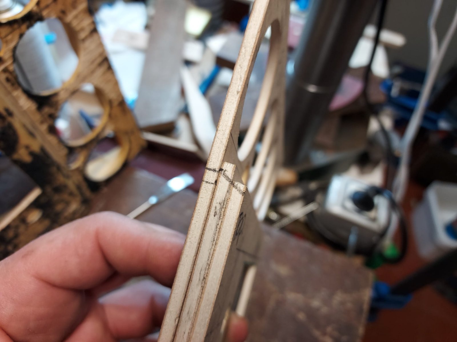
Hi Scott - As you can see from the early posts in this thread, I stole from DeQ's design on the gauge spacing to the extent I could. I actually had to modify his computations on the shape of the gauge plate because I was starting with an A/C console which has both a different opening and different side angles from an non-A/C console. Once I had the rough gauge spacing and plate shape, I then spent a bunch of time taking pictures of interior designs - particularly from Italian cars - to get ideas for the rest of the design. I found a couple of Alfa Romeos that had a bezels that tilted the gauges toward the driver, which I rather liked, but I didn't have the room to do this (the farthest gauge wiring could not be made to work with this tilt.) Other Italian interiors had the gauges inset into the dash, but I was really tight for wiring room and there was no way I could inset the gauges. Either through looking at Italian interior designs, or though the process of looking for tilted bezels, I stumbled across these hoods. I think I ultimately bought them from Summit Racing. I retained the packaging and have the manufacturer and part number in a box in storage. I'll dig out that info over the next couple of days and post it here.
Anyway, once I settled on a design my nephew, who was working on his Masters in Architecture and had access to a fairly precise laser cutter for modeling, cut the piece that I covered and used to moung the gauges. I have the final drawing of this, and may well have a CAD file as well.
As to the final design, Stevehose once asked me why I needed the two switches and what there were for. I replied I didn't need them; I installed them because I wanted my design to include a couple of switches and then needed to come up with some function for them.
Last edited:
Hi Scott - As you can see from the early posts in this thread, I stole from DeQ's design on the gauge spacing to the extent I could. I actually had to modify his computations on the shape of the gauge plate because I was starting with an A/C console which has both a different opening and different side angles from an non-A/C console. Once I had the rough gauge spacing and plate shape, I then spent a bunch of time taking pictures of interior designs - particularly from Italian cars - to get ideas for the rest of the design. I found a couple of Alfa Romeos that had a bezels that tilted the gauges toward the driver, which I rather liked, but I didn't have the room to do this (the farthest gauge wiring could not be made to work with this tilt.) Other Italian interiors had the gauges inset into the dash, but I was really tight for wiring room and there was no way I could inset the gauges. Either through looking at Italian interior designs, or though the process of looking for tilted bezels, I stumbled across these hoods. I think I ultimately bought them from Summit Racing. I retained the packaging and have the manufacturer and part number in a box in storage. I'll dig out that info over the next couple of days and post it here.
Anyway, once I settled on a design my nephew, who was working on his Masters in Architecture and had access to a fairly precise laser cutter for modeling, cut the piece that I covered and used to moung the gauges. I have the final drawing of this, and may well have a CAD file as well.
As to the final design, Stevehose once asked me why I needed the two switches and what there were for. I replied I didn't need them; I installed them because I wanted my design to include a couple of switches and then needed to come up with some function for them.
hi,
i have 2 comments:
IMHO, the result looks better if you can set the gauges panel inside the heater vent grille, not over it (orange arrow)
and i see (blue arrows) that your wood is very high in the area, muts be 4cm lower, doing this you will have a great opening and space for objects
The execution of the change is great! They are both nice.
Gauges instead of warning lights fits the spirit of the car and the times (the 70s I mean).
PS: The best part of the picture is the manual windows sans switches for the front.
On Sunday a friend was telling me he keeps emergency hammers in every car following the sad story of Angela Chao drowning in a Tesla after accidentally driving into a pond.
Yes, both of your comments are valid. My car has A/C, which means I have a lot less room in this area as compared to a non-A/C car.hi,
i have 2 comments:
View attachment 179174
IMHO, the result looks better if you can set the gauges panel inside the heater vent grille, not over it (orange arrow)
and i see (blue arrows) that your wood is very high in the area, muts be 4cm lower, doing this you will have a great opening and space for objects
The gauge panel sits on top of the vent grille because unlike your vent grill, mine has paint damage across the bottom edge, which this installation covers. In addition, my console is actually narrower in that area than a non-A/C console, so I needed the width to be able to install four gauges. If I went inside further and under the vent grill, the gauge plate would have very little material on the top. In addition, bringing the gauge plate out gained a few additional mm of depth for wiring, which I needed.
As to the depth of the wood tray installation, in the mock up I did with a non-A/C console, the tray was installed much lower. I couldn't go this low with the console in my car, but I don't recall exactly why. I am pretty sure there was something in that area blocking a lower installation because I agree a deeper tray would look better.
Last edited:
I agree with Arde, they both look great! Everyone has a micro hindsight thought, I guess...Mine is that the wood tray, which had a previous purpose, now looks overlain with the gauge assembly, and looks odd. I like DeQ's comparison pictures with and without, that shows best what I mean. With a gauge assembly, I think my preference would be to lose the wood tray, and instead have a black vinyl-covered tray with a back wall/lip that would prevent coins, etc. from sliding under the unit, and "complete" the unit.
Both look much better than my car, so I will now shut up...
Both look much better than my car, so I will now shut up...
sine my coupe has A/C, this location is problematic - i like @Stevehose approach ... using the Alpina 3 gauge cluster in lieu of the speaker grille. BTW - for anybody interested in this approach, our friend @halboyles is making a 3 gauge panel for the speaker grille with angled gauges ... don't know if he has finished them or started selling them yet. if you are interested in this approach, contact Hal.

