72 3.0 CS 2240344 Restoration

I'll be spending the weekend assembling work benches and organizing the space. Planning to build some frames to hold big items like the hood, and the doors, so I can work on them without having them either on the car, or getting banged up on the floor leaning against the wall.

I am also planning to remake the entire wire harness (the current one is a hot mess, and is 53 years old...). to do that I am going to create a vehicle "buck" that allows me to position the wires in 3D to create the new harness. I am working on this idea with a fellow forumite, so we'll see how this progresses.
 
Last edited:
Moved my son's old Bronco over to the shop today. Had to drill out the ignition key tumbler since the key seems to have disappeared. My that's a terrible vehicle to drive! Steering wanders all over, very stiff suspension, etc.. Planning to drop an EFI crate motor in it since the carbureted 302 is pretty balky.. A project for a time after the E9 is done...

IMG_5082.jpg
 
I know this is step 4001 in the restoration, but I am wondering what techniques the forumites have used to renovate the original aluminum roundels. Mine are the aluminum ones with raised lettering. I am pretty sure I can polish the aluminum to a high shine. So what is best to fill the colored areas?

On my Bronco I renovated the FORD letters in front using carefully matched and carefully applied nail polish. Several layers of polish did a good job of creating a shiny fill. I was thinking of doing the same on the roundels. I am hoping that I can get the layers of polish thick enough that they at least partially fill the places that are not raised, although I'm a bit concerned about the curve of the roundel causing the polish to be thicker around the outer edges of each recessed area.

Thoughts or suggestions?
 
Last edited:
go to Home Depot, Lowes or Costco and buy a bunch of the black plastic boxes with yellow lids and organize the parts into boxes as you take them off. take tons of pictures. i would also write a list of things you put into the boxes. you can organize the boxes how ever you see fit, but i suggest organization like exterior trim, interior trim, doors + windows, trunk, hood, brakes, lights, etc. then, when you buy new stuff, you put the new parts into the same organization.

i also recommend that you create bags that work with the orange book / real oem pages for all new bolts, nuts, washers + screws - keep the old ones and match the new ones as you replace them.
I was thinking of doing a bolt inventory using realoem, and then just buying a pile of bolts, nuts and washers from Belmetric, and putting them in one of those plastic drawer organizers, so I have a stock ready when i need it
 
Start by looking in the FAQ There is a list by location and another by size in the thread I started with technical drawings etc. it’s not 100% accurate but a good start
 
And again!

We will probably be re-covering these in a white/grey leather...
 

Attachments

  • Screenshot 2025-10-31 at 8.58.53 PM.png
    Screenshot 2025-10-31 at 8.58.53 PM.png
    2.9 MB · Views: 52
  • Like
Reactions: LEO
OK. Having some fun now!
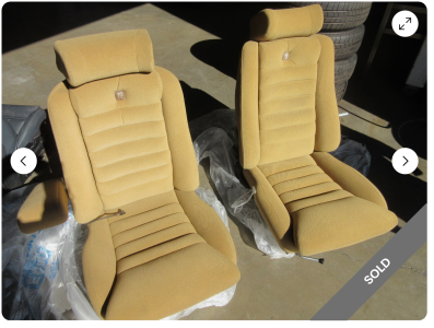
The car will go back to its original Fjord Blau color. And having found some vintage Scheel seats that need re-covering, I have been working toward a decision on leather color. My wife is lobbying for a white-ish interior, so I ordered an array of different white leather samples. I have read that Fjord on white was an option, albeit a rare one. We are long past children and spills, so the notion of upkeep on a white interior is not too daunting. It will likely have a darker carpet, obviously...

So to provide some basis for this important decision, I ordered a spray can of Fjord paint, and started making a "mood board". This is basically an interior design tool to provide a visual representation of the colors and textures for the end product (in this case a car instead of a room).

The array of white leather colors was huge, with most of them coming in on the yellowish green side, which did not seem to fit well with Fjord. We narrowed down the leather colors to a couple. One was a soft white and the other had a grayish tinge. We were both leaning toward the soft white, until the Fjord paint arrived...

The choice was obvious at first look. The grayish tinge calms down the brightness of the leather against the blue paint, and pulls in the metal trim.

Here is the mood board at present... I plan to add in some black vinyl and some wood trim to complete the look, That should also help me finalize the veneer choices.

First two are my color preference, the second two are the whiter color. Seems a bit too bright for my taste.
Screenshot 2025-11-11 at 10.29.40 AM.png
Screenshot 2025-11-11 at 10.30.52 AM.png
Screenshot 2025-11-11 at 10.30.01 AM.png
Screenshot 2025-11-11 at 10.30.37 AM.png


So, now to go pull the interior of the car out and send it off for some re-upholstery work!
Cheers,
Scott
 
OK. Having some fun now!
The car will go back to its original Fjord Blau color. And having found some vintage Scheel seats that need re-covering, I have been working toward a decision on leather color. My wife is lobbying for a white-ish interior, so I ordered an array of different white leather samples. I have read that Fjord on white was an option, albeit a rare one. We are long past children and spills, so the notion of upkeep on a white interior is not too daunting. It will likely have a darker carpet, obviously...

So to provide some basis for this important decision, I ordered a spray can of Fjord paint, and started making a "mood board". This is basically an interior design tool to provide a visual representation of the colors and textures for the end product (in this case a car instead of a room).

The array of white leather colors was huge, with most of them coming in on the yellowish green side, which did not seem to fit well with Fjord. We narrowed down the leather colors to a couple. One was a soft white and the other had a grayish tinge. We were both leaning toward the soft white, until the Fjord paint arrived...

The choice was obvious at first look. The grayish tinge calms down the brightness of the leather against the blue paint, and pulls in the metal trim.

Here is the mood board at present... I plan to add in some black vinyl and some wood trim to complete the look, That should also help me finalize the veneer choices.

First two are my color preference, the second two are the whiter color. Seems a bit too bright for my taste.
View attachment 211166View attachment 211169View attachment 211167View attachment 211168

So, now to go pull the interior of the car out and send it off for some re-upholstery work!
Cheers,
Scott
I have an original fjord-on-white leather coupe. It is rare indeed and very 70s; I love it!! I will try to post pictures. This combo gets a lot of eyeballs and positive comments.
 
Thank you. Pure white works well, IMO, but a light creamy white (Chamonix, if you will) would also be an amazing pairing with fjord. With good leather cleaning/conditioner products, I have no problems keeping it white.
 
Hi Scott, I love your 'Mood Board, it's like watching the 'Property Brothers' on HGTV. Looking at the options you presented, I would skip the first one, it looks pretty grey to me - too many new cars have boring grey interiors. If you are going white, go white! I've seen Mike's car in person several times, the bright white with the Fjord looks amazing - and it's so 70s in a very good way.
 
i really like the light gray tint of the white ... looks great with the fjord. but i have to agree with @HB Chris and parchment - reminds me of the Paul Cain 3.8 CSi.

paul cain 1.jpg


seat belt rear - paul cain.jpg

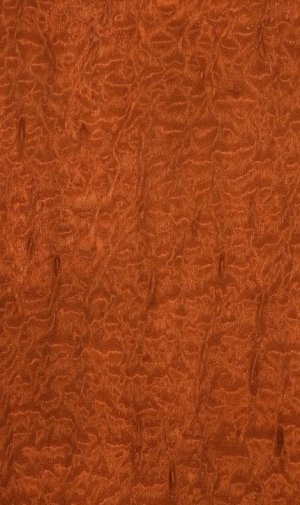
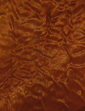
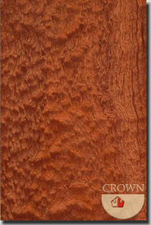
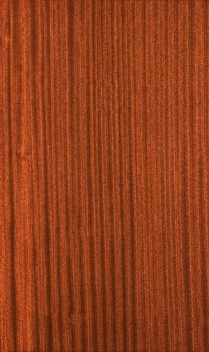
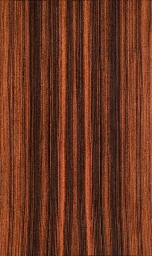
if you want a veneer that goes really well with the mahogany in the Nardi, you should look at a figured Etimoe. this is the wood i used - this is a clear finish on the wood. mahogany has an orange tint but is also an open grain wood and generally appears more 'rough' than the original walnut. the etimoe sands very smooth. there are also woods like macore and sapele which are of the mahogany family which can be smooth ... but some of the pomele quilt figures of those woods are gorgeous. the ribbon stripe sapele is also very interesting. the next question for your mood board is the carpet + door panels. and whether they match the seats or the carpet contrasts the seats / door panels. i like the floor contrast especially with light colors. if you use the 'gray' white, then maybe the 2 tone charcoal would work well.

rsp wood 1.jpg
 

Attachments

  • macore_rotary_cut_pomele.jpg
    macore_rotary_cut_pomele.jpg
    114.4 KB · Views: 16
  • QuiltedPomeleSapele.jpg
    QuiltedPomeleSapele.jpg
    37.5 KB · Views: 15
  • 49_Kosipo pomele.gif
    49_Kosipo pomele.gif
    123 KB · Views: 15
  • sapele_quarterer_cut_ribbon.jpg
    sapele_quarterer_cut_ribbon.jpg
    131 KB · Views: 12
  • rosewood_santos_quartered_plain.jpg
    rosewood_santos_quartered_plain.jpg
    126.5 KB · Views: 18
Last edited:
Hi Scott, I love your 'Mood Board, it's like watching the 'Property Brothers' on HGTV. Looking at the options you presented, I would skip the first one, it looks pretty grey to me - too many new cars have boring grey interiors. If you are going white, go white! I've seen Mike's car in person several times, the bright white with the Fjord looks amazing - and it's so 70s in a very good way.
I thought so too until I actually saw them inthe sun
i really like the light gray tint of the white ... looks great with the fjord. but i have to agree with @HB Chris and parchment - reminds me of the Paul Cain 3.8 CSi.

View attachment 211254

View attachment 211255
if you want a veneer that goes really well with the mahogany in the Nardi, you should look at a figured Etimoe. this is the wood i used - this is a clear finish on the wood. mahogany has an orange tint but is also an open grain wood and generally appears more 'rough' than the original walnut. the etimoe sands very smooth. there are also woods like macore and sapele which are of the mahogany family which can be smooth ... but some of the pomele quilt figures of those woods are gorgeous. the ribbon stripe sapele is also very interesting. the next question for your mood board is the carpet + door panels. and whether they match the seats or the carpet contrasts the seats / door panels. i like the floor contrast especially with light colors. if you use the 'gray' white, then maybe the 2 tone charcoal would work well.

View attachment 211245
Funny you should mention Sapele. I was pondering the Mahogany Nardi wheel, and thought of that too. My front door, staircase, bedroom floors, office floor, and a lot of interior trim in my house are sapele.. My work with Sapele (I used a lot of it on my antique boat too) is that it may not make a very good veneer because of the interlocking grain You can only plane it in one direction or it tears.... I have some Wenge veneer that I got for a different project but never used. That might be a bit severe. When I first got the coupe I got some Bubinga veneer, but seeing that today, it is way too red, and awfully curly. I'm actually really liking your Etimoe! Interesting without being overwhelming. What did you use for that satin finish? Very classy!

And yes, I am leaning toward a grey or blue grey square weave carpet. Need something darker to ground the interior.

Door panels will match the seats.

Wayback when Paul did that 3.8 I found and bought a Euro front spoiler like his. So that's part of the "look" (it is the same basic style as my Euro 635.
 
Back
Top