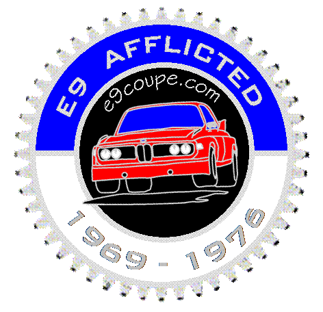
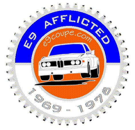
Grill Badge - E9Coupe.com

As requested:
606c275c03eb48bcddeb554a3a656915.gif

c45e98c2df25dd705af9d9714a64c0cc.gif

We can easily lose the wing if it is generally desired. Also, please note I added a bit of a "cat's eye" to the headlights - this would probably be more pronounced on a badge with real chrome.
 
badge

I am all for promoting the site, but there is something not quite right about listing a website address on a 35+ year old car...
 
I still like "Lunatic E9 Fringe".. but I can accept "Afflicted".

I like the red on black version. The Inka clashes with the blue.

My ONLY suggestion would be to go back to a less scripty font for the URL. It seems out of place.. Or drop the URL entirely.

NICE WORK!!

S
 
Badge

Another two cents...

Ok, I agree with Ed G. Perhaps curator, preservationist is stodgy & stuffy and doesn't speak to the intrepid spirit here...

But E9 Afflicted?

While we indulge our passion without reservation, and up to the limits of our wallets, do we really want a badge that honors our illness...rather than the car?

Can we come up with another phrase? E9 Driver perhaps? or something catchy that respects the car and our collective.

I also think we need to change the font of the URL ...
We're getting close though ...
 
Hey there fellow Coupers,

Been watching the 'evolution' of the badge and I think its getting real close. Nice job everyone. My coupe will wear it with pride.

Being in the graphic business, I would suggest acquiring some 'production guidelines' from the badge Mfg ASAP. I wouldn't be surprised if the source/production file needs to be vector based (Eps. file from Illustrator or?) Other file types might 'rasterise' (those jagged lines) or may not be compatible with the Mfg's system. Also there might be a minimum line width (point) that can be reproduced/cast, ie. some detail might not reproduce well or at all.

Just a heads up from a production artist, what looks good on a screen may not reproduce the same way in the final product. Check by looking/printing it in the final size. Is all the detail clear and ledgible?

As for my 2 cents on the design: Classic flyin' White Bat w/ no CSL stripes on Inka/Colorado background. I'd use the same font (or close, maybe all caps) as the original roundel if possible. Too many different fonts can get 'messy'.

Keep it simple and elegant....like the our coupes.
HTH!

-shanon
 
My stab ...

I am not versed at posting images using BBC code, so if someone can help out ... I would appreciate it. The link is: http://www.bmw2002registry.com/imageHosting/images/rns7602/rns7602/e9motorsportrns.jpg

In short, those who know, get it. And if you dont ... The Motorsport logo evokes raw emotion. As the e9 is considered to be the first M car, I thought it made sense to base a badge off of it. I used all of the colors we see most often on our coupes - and those we do not - in place of the standard BMW colors. I agree with Shanon around design boundaries so some of this might work and tried to be sensitive to branding concerns.

Motor sports are a time consuming and expensive hobby. I figured that without writing anything out just having that logo would explain or speak to the addiction, craziness, money pit, etc.

I stayed up all night designing it and the last few hours trying to figure out how to post it. I'm done. The colors are festive, but I thought it should be eye catching yet still subtle. I agree that less is more, hence why the car is so clean and timeless. I wanted to put a hammer and a can of Por 15 in the propellors and put it behind the car out of jest but thought better of making fun of everyone and especially myself. We all have had Dear Old Bucket episodes. A friend said my car stood for "be my wife" due to the amount of time and money spent. I had to laugh and promised that if they ever left, I'd have something in my pocket.

Back to the design, I have met so many who did not know of the forum. I figured why not celebrate our beloved forum on the badge? Its a global resource and place of fellowship. I'm sure some will like and others may use it as a foundation for a better design - part of the design process. I thank everyone who posted first. It's always easier to edit or revise then to create new. BMW can be written into the black ban for our purposes but for the integrity of this site, I left it out.

Anyway, hope you all enjoy. As a trained historian and policy analyst, I had fun with the thread and having a chance to go back to my arts and design past. At the very least, we might get a new logo for the site, t-shirts/hats or stickers. We can write anything we want on it from "driven" to "no queens" (as in garage).

Happy September. Please feel free to comment or revise.
 
Thank you Mark! I usually cheat by posting to another site but I lost the link I had with the code to make it appear here. Thank you for the PM and the reminder/tutorial.
 
E-9 Design Struggles--simple and so true-----

"E-9 DRIVEN"

Gets my nod for a strong message as it describes what many of you now share in the drive to get your Coupe in drivable condition--eh Malc?

And then there are a few of us that the word correctly describes "staying the course" with a Coupe--in my case--for nearly 36 years, covering several hundred thousand miles of travel, touring often at grossly illegal speeds, surviving 2 marriages, deaths in the family, homes, businesses, children, friends and lovers--did I leave out anything? Through it all the BLUMAX and his willing keepr have soldiered through it together--and remain bonded--and I still enjoy taking him out for a nice stretch. It's triple digit temps here today--Fahrenheit that is--but the A/C in BLUMAX blows cold, the heat guage says 3 o'clock as I was scooting down the 55 Freeway from Irvine a few minutes ago--along with a few thousand "inlanders" heading to the beach.

Earlier today had a couple of hours at cars 'n coffee--with many car guy friends nearby--displaying a splendid Fjord/black 1972 enhanced 3.0CS equipped with all of the good stuff including sunroof--think we have a couple of serious tire kickers--both disclosed they had been looking for a nice Coupe for some time and hadn't seen any comparable to--BMW CS--the plate on that Coupe that stays with the car.

My vote as I'm "E-9 DRIVEN"
 
Whispering bomb...Bavarian cream..The legend..Fly tii....These were all great slogans..Ads..expressions etc..
I don't think the board has caught the right slogan yet !
Also if your going to use... "e9 coupe.com".. inside the badge...Maybe we could come up with a slogan without repeating "E9"...just a thought !
How about focusing more on what an e9 is?...Was?.... represents? Rather than what most of us are doing with them...like spending all our cash on them.
Some words that come to mind when thinking of coupes....
Style..elegance..automotive art..cruising... coupe...styling..legendary..beauty..timeless..70's ...coupe sport..Das coupe......beauty in motion.
Personally I think they got it smack on.... with......"Bavarian cream"

Just my 2 cents
Giorgio
 
perhaps instead of inflicted. Sounds to infectious.
As we all know, it is!

E9 OWNERS (associated)
COUPE OWNERS " Intl'

"Bavaria's Best" , @top of badge-E9 COUPE bottom, (with smaller print .com)-could use bavarian flag or coupe background.

I have a minds eye, but not enough computer skill to reproduce.

Throw out suggestions and see what sticks!
steve
 
I personally like the production years. I also like the E9-DRIVEN and BAVARIAN CREAM motifs. Since this forum is the source I think we should include a reference if possible. I have drafted up a few more variations. The Bavarian flag is tough to deal with since it creates a "busy" look. If used, it really should be kept within a confined region with no text.

This is in honor of the German flag (Black, Orange, Red).
a76c70a07f33a5cc9bf594f7718ac7d1.gif

a23c367e1a2f1c2f2ef6a8fbfb006e8b.gif
 
And now, courtesy of photos from X-Atlas who unselfishly dismantled his engine for the cause....
a real 36 tooth M30 cam gear border (master looks better),
a more aggressive stance,
inka color for the more radical elements on the forum (red is nice too!),
E9-Driven for those of us not sitting on a couch,
the web site acknowledgment,
the years of production, and
the official BMW colors.
.... Perhaps we should use an off-white to symbolize Bavarian Cream...
0f49dd5877aa4e3030eb42f875ed355d.gif

Now, where to use the Bavarian flag theme?
 
Was plain ol' 'E9 enthusiast' mentioned before? I believe some on this site don't have an E9 to be driven (yet) as well as some have one but is in no condition to be 'driven'. Just throwin' it out there...
 
..........I'll second.

cam gear, flyin' inka Bat (also celebrates ALPINA, the Jagermeister car), BMW colors Blu & Blk. I think the white (or cream!) background is the 'cleanest'.

just my .02
-shanon
 
Back
Top